HYDRA is a package and brand redesign of an inexpensive product, Hydra Aromatherapy Shower Burst, and increases the value of the product without increasing its intrinsic price. The redesign exhibited these 3 essential qualities/properties for meeting sustainability: reduction of overall materials, reusability, and recyclability.
RESEARCH
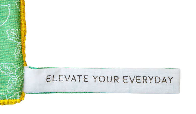
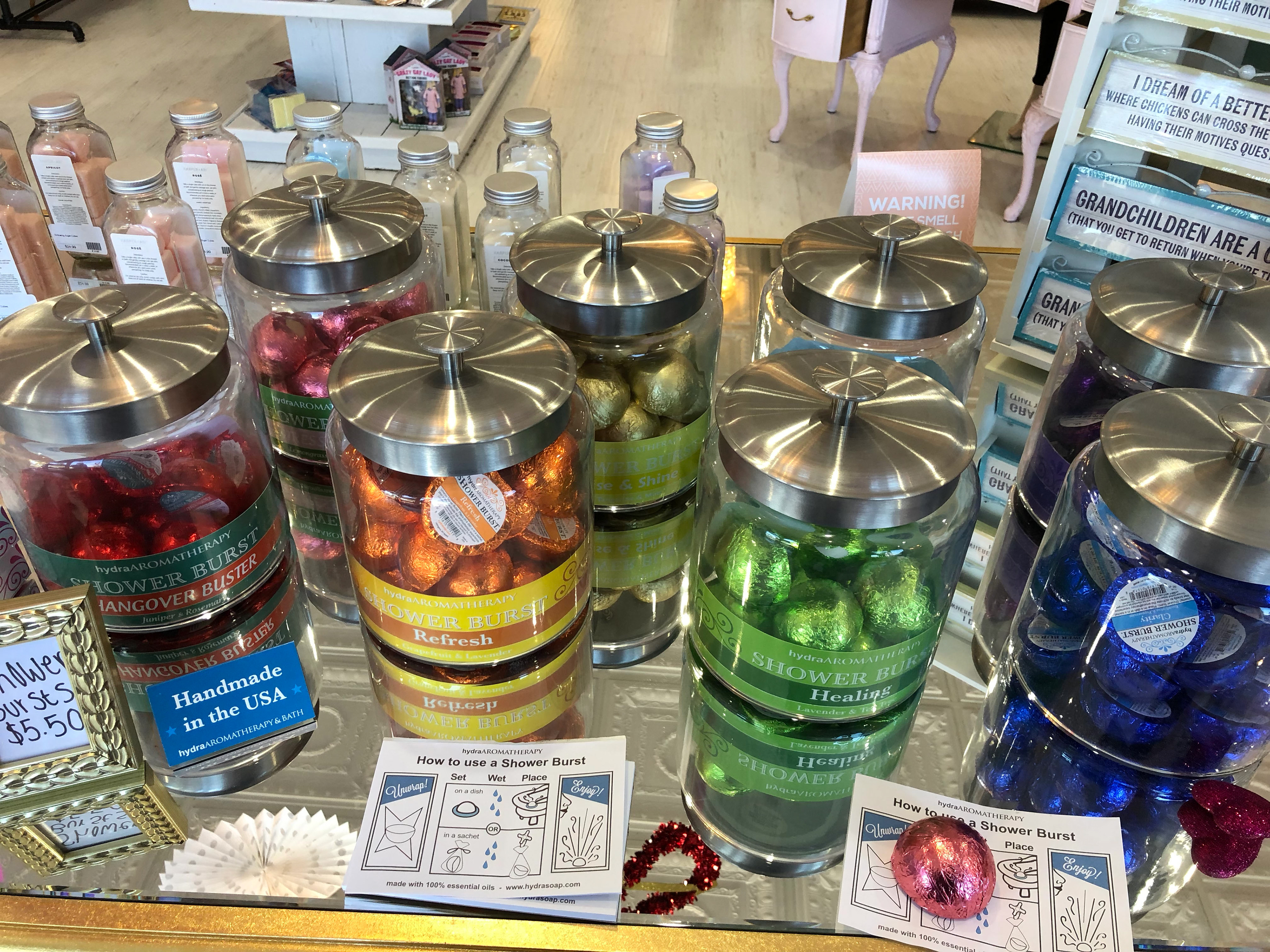
Researching Hydra Aromatherapy's website, online store, products, its mission, values, slogan, and current assets, including logos, has helped me understand the company itself. As a consumer, I gained experience by visiting the store, purchasing, opening, and using the item, which helped me visualize how I can improve the product and the experience for future buyers. I have decided to keep Hydra's slogan "Elevate the Everyday". Hydra's original rebrand story was long so I decided to develop a shorter version with a few revisions.


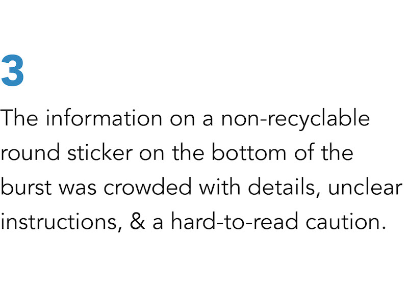
JOURNEY MAP
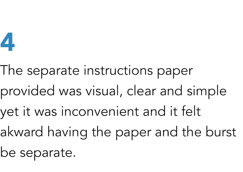
Based on my user experience, below is the journey map I created that consumers will experience step by step before reaching the goal of their purchase. This helped my thinking and direction in rebranding design of the product.
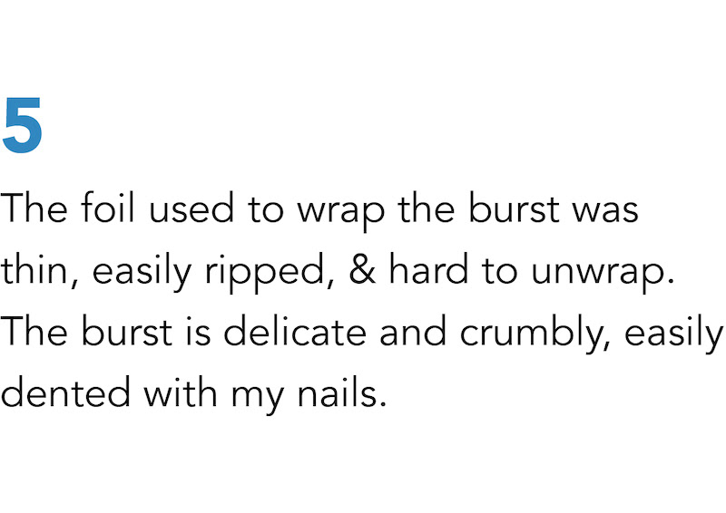
Click images to enlarge
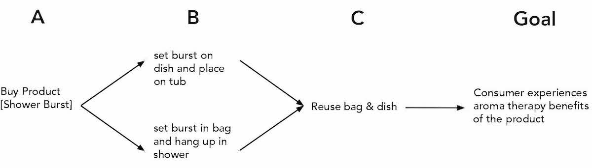


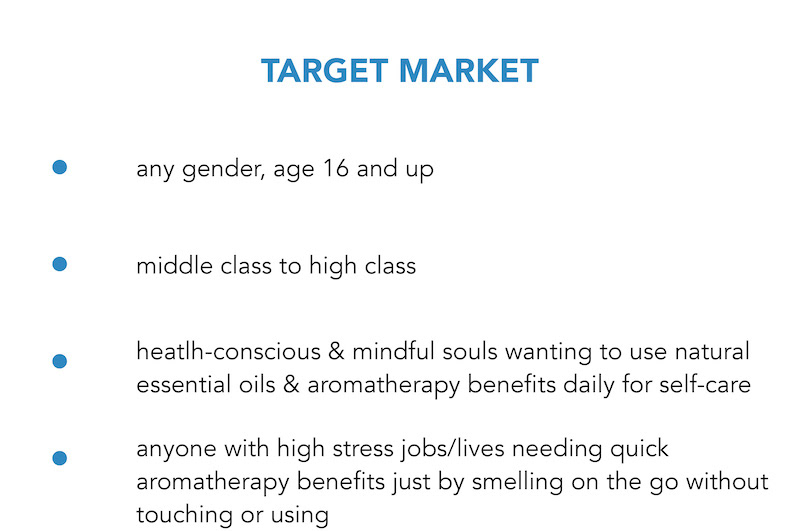
The products should be affordable yet have high quality compared to other brands.

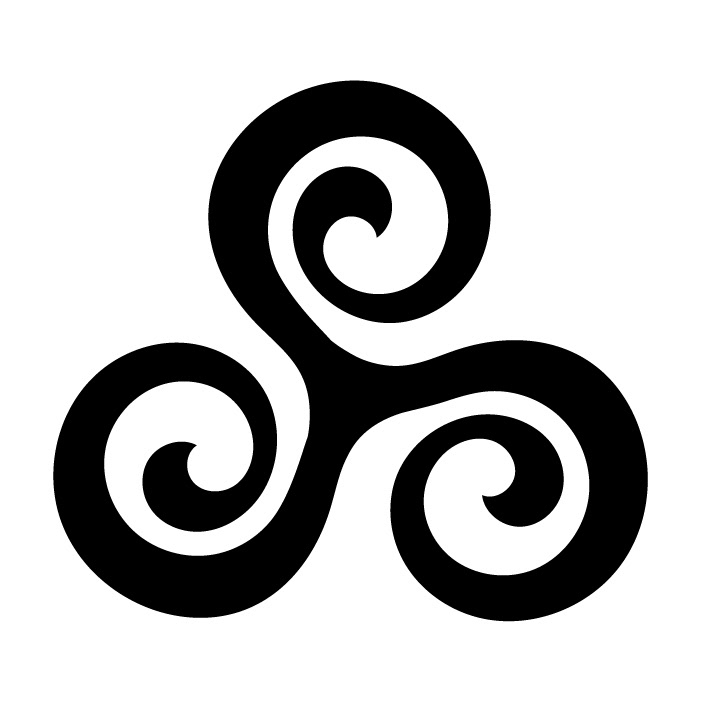
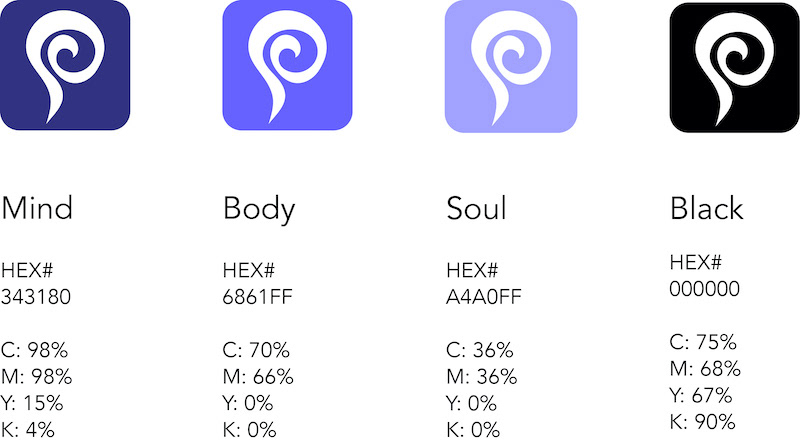
NEW LOGO
The repetitive symbol of three swirls represent mind, body, and soul united as one. Hydra cares about your health and aromatherapy is powerful & beneficial health-wise for everyone if used everyday.
The swirls also create the motion of releasing aromas from the product’s essential oils.
The logo shape is a triangle pointing up, uplifting, and fits the product’s slogan, “elevate the everyday”. The light colored swirl symbolizes the scent will soon permeate the air, filling our senses, benefitting our mind, body, and soul as well as our health.

Secondary logos


COLOR PALETTE
Color choices represents the aroma through water and air creating calmness and mindfulness moods.
TYPE PALETTE
Thin, light, modern, san serif font was chosen and best fit to reflect the company's uplifting and aromatic value.

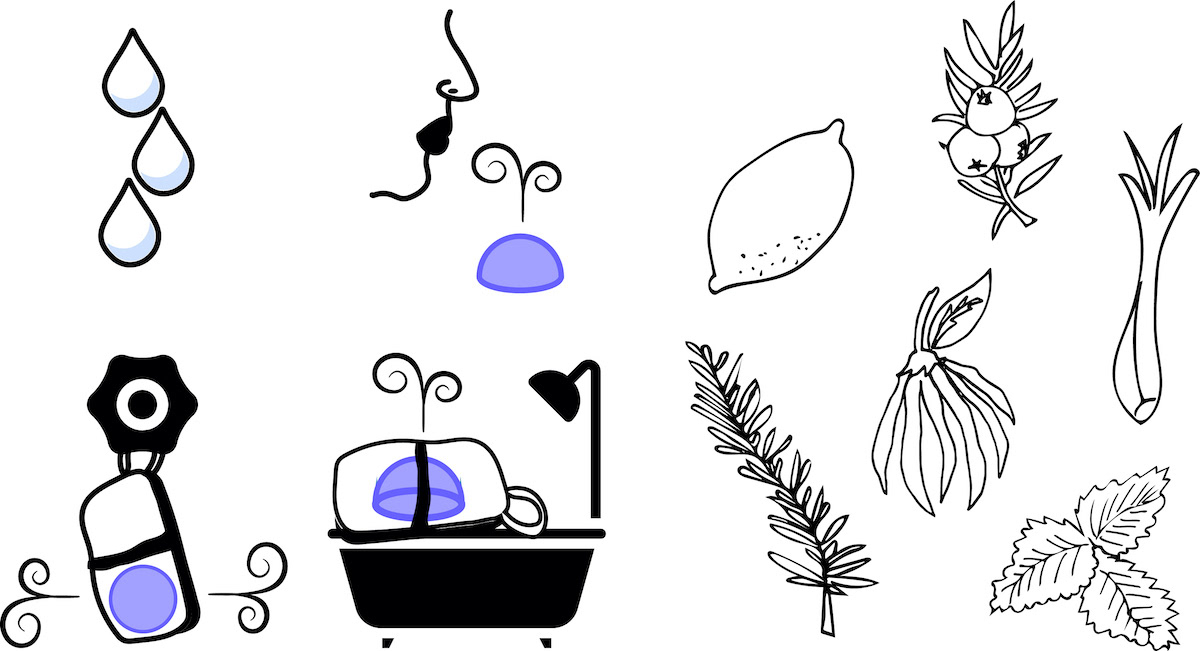
ILLUSTRATIONS
Handmade illustrations were used to keep the idea of products being handcrafted and to create a light, uplifting, handmade, and personal feel.
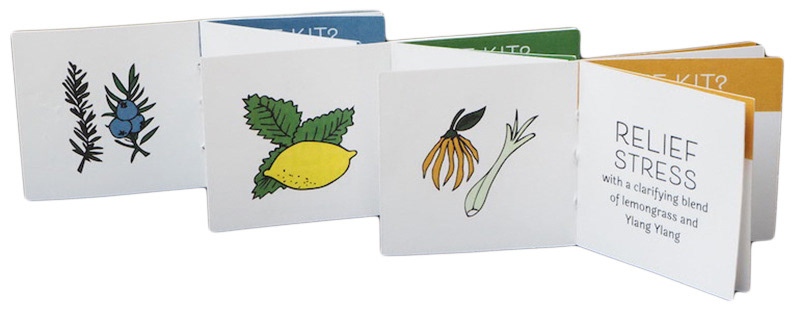
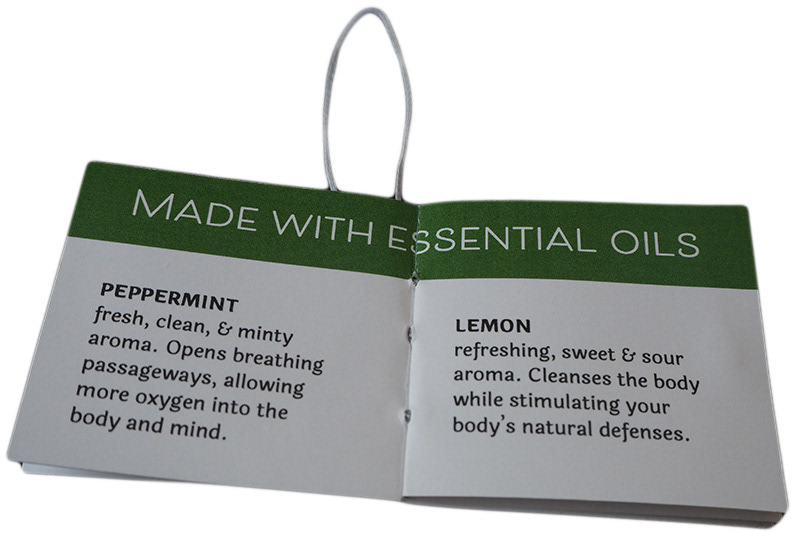
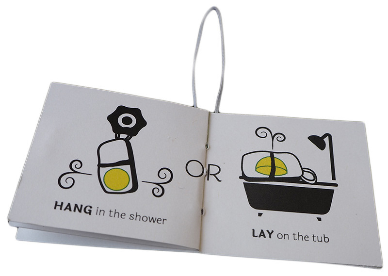
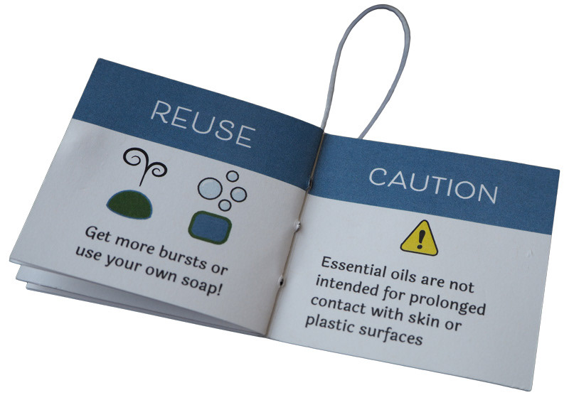
INSTRUCTION BOOKLET DESIGN
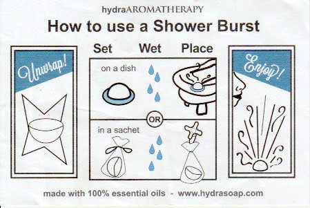
To keep the importance of seeing the sachet's design and not allow the labels to overpower, the instruction booklets measure about half a size smaller. Even though they are small, the information and instructions are simple, clear, and color-coded matching the sachet design. There are illustrations included to be used as visual aids for easier comprehension. They are saddle stitch bound with white waxed thread leaving a loop to attach to the ball chain as a final touch.


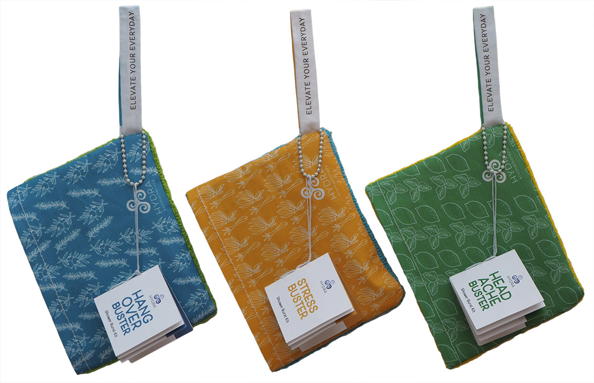
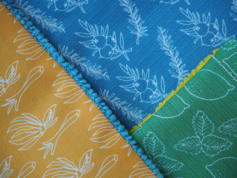
SACHET COVER & LOOP DESIGN
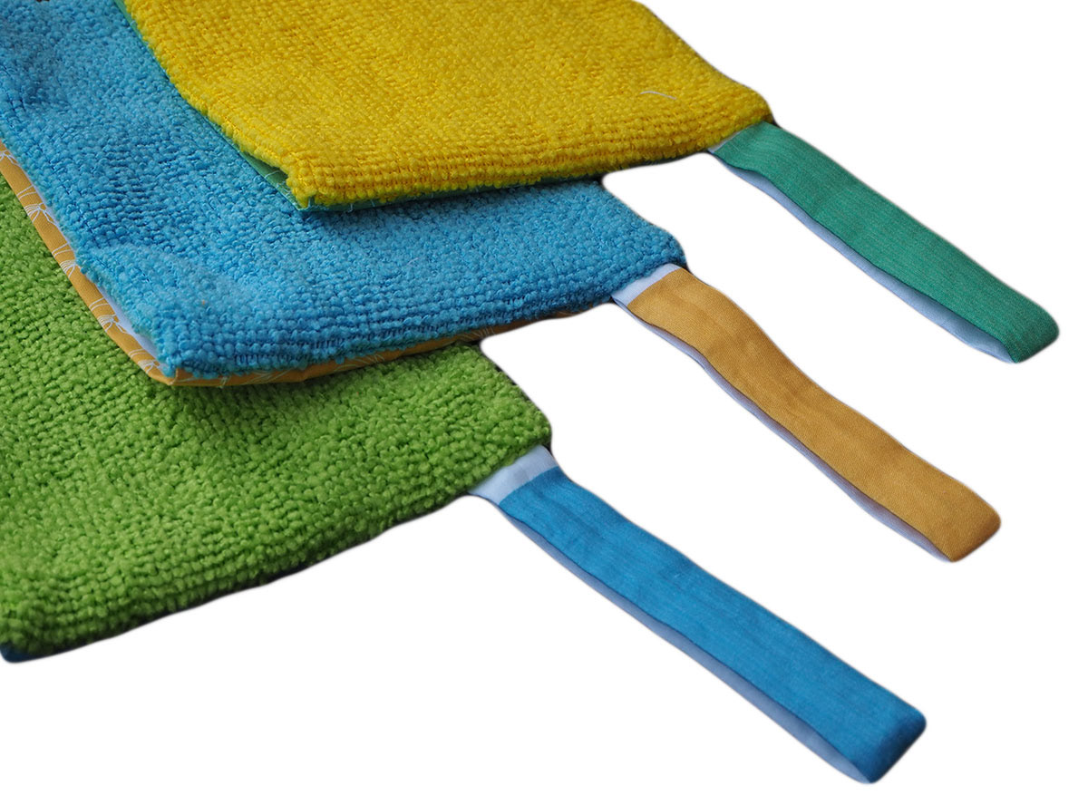
Sachet covers and loops are printed on 100% cotton fabric sheet and were sewn to the rest of the sachet handmade of 100% soft microfiber which can be reused for multiple uses with more shower bursts or even soap bars.
The repetitive pattern on the sachet cover has illustrations reflecting the oil scents matching the burst ingredients.
The colors were chosen to fit with the product's essential oil scents and to create an attractive design.

Hangover Buster: Rosemary & Juniper
Headache Buster: Lemon & Peppermint

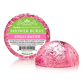
Stress Buster: Lemongrass & Ylang Ylang
front design
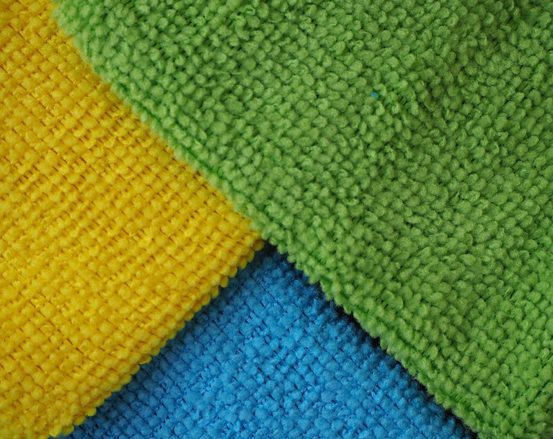
microfiber towel backs

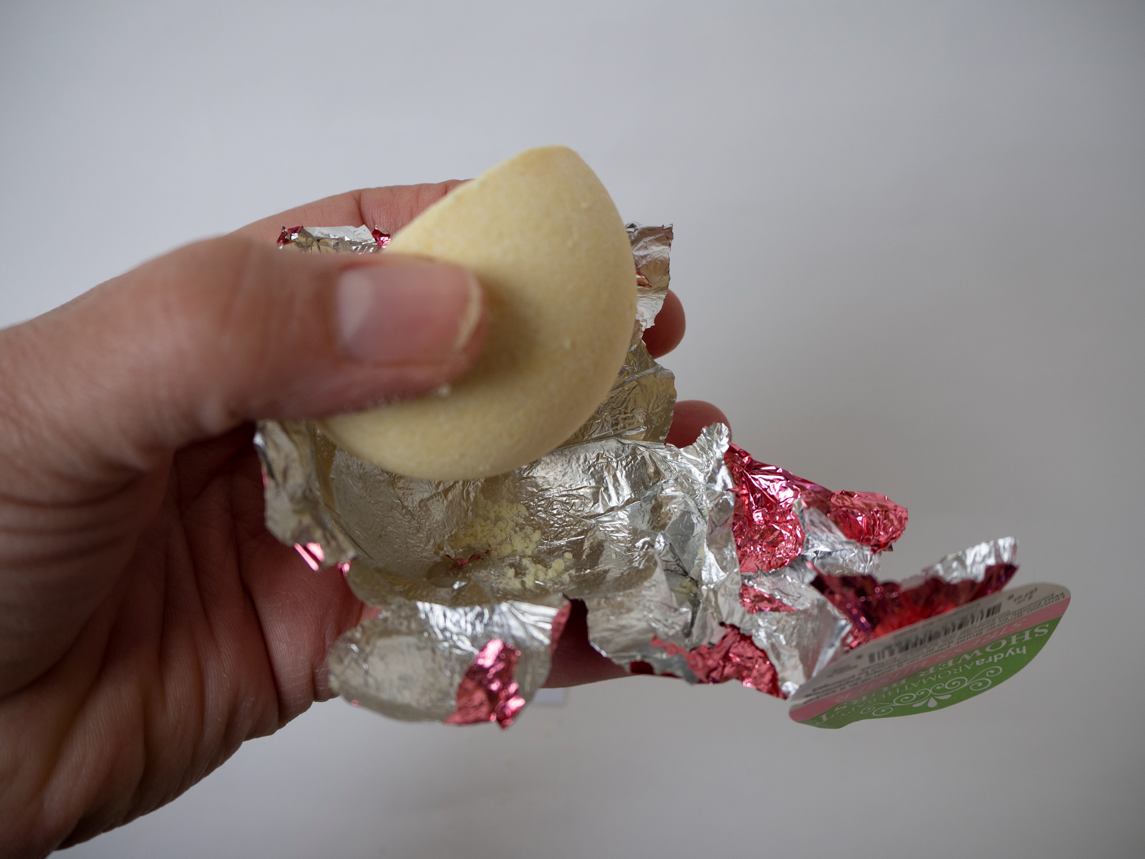
THE BURSTS
To achieve sustainability, the main item, the burst, will be wrapped in dissolvable rice paper, leaving zero waste.
THE SHOWER BURST KIT
The final product contains a rice-wrapped burst inside the sachet with a final touch of the instruction booklet attached to the sachet's loop with a ball chain. It can be easily hung up on hooks at the stores or lie in a basket for display. The instruction booklet can either be kept as a reminder or recycled; the rest of the product is reusable.

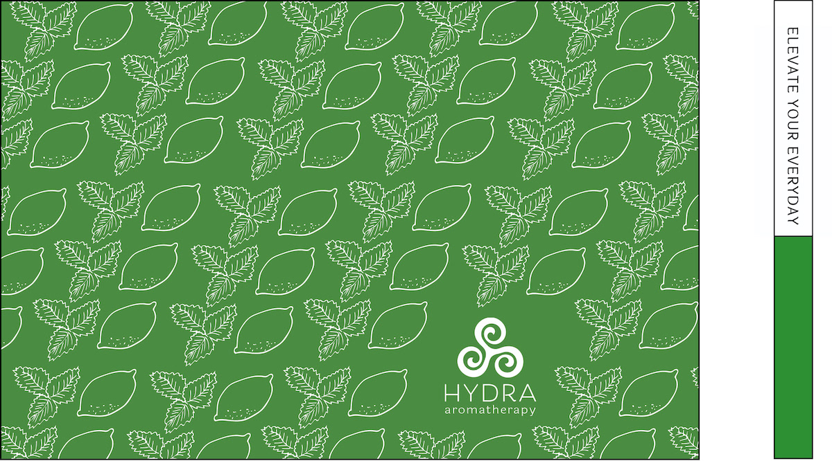
ELEVATE YOUR EVERYDAY!
PROCESS