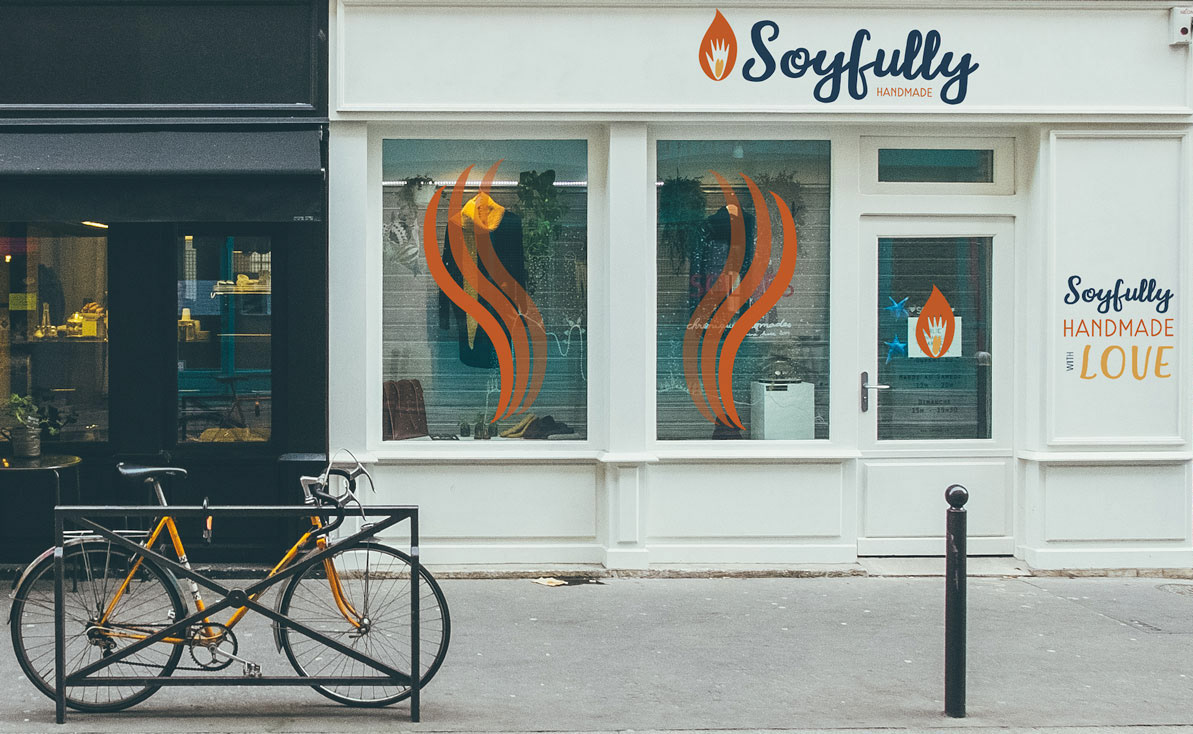
SOYFULLY is a brand identity redesign of a local mom and pop business in Austin, Texas. The business was called The Burlap Bag, a gift shop with many unique handmade items from over 100 artists and designers along with the owners' own line of homemade silly-named soy candles.
RESEARCH
In order to visualize and plan rebranding identity, researching, browsing their website and shop site online, joining their instagram, and shopping as a consumer were done. A few chosen candidates visited the shop as well and shared their experiences. I found a few competitors to compare with The Burlap Bag to see which areas needed improvement. The opportunity to meet one of the owners and converse with the other through email was grand.
CHALLENGES
Their challenges were the business name, branding, and advertisement.
There was lack of consistency in advertising their business and how they expressed what their business is all about. The business is run by a young couple with two little kids and they probably have limited budget.
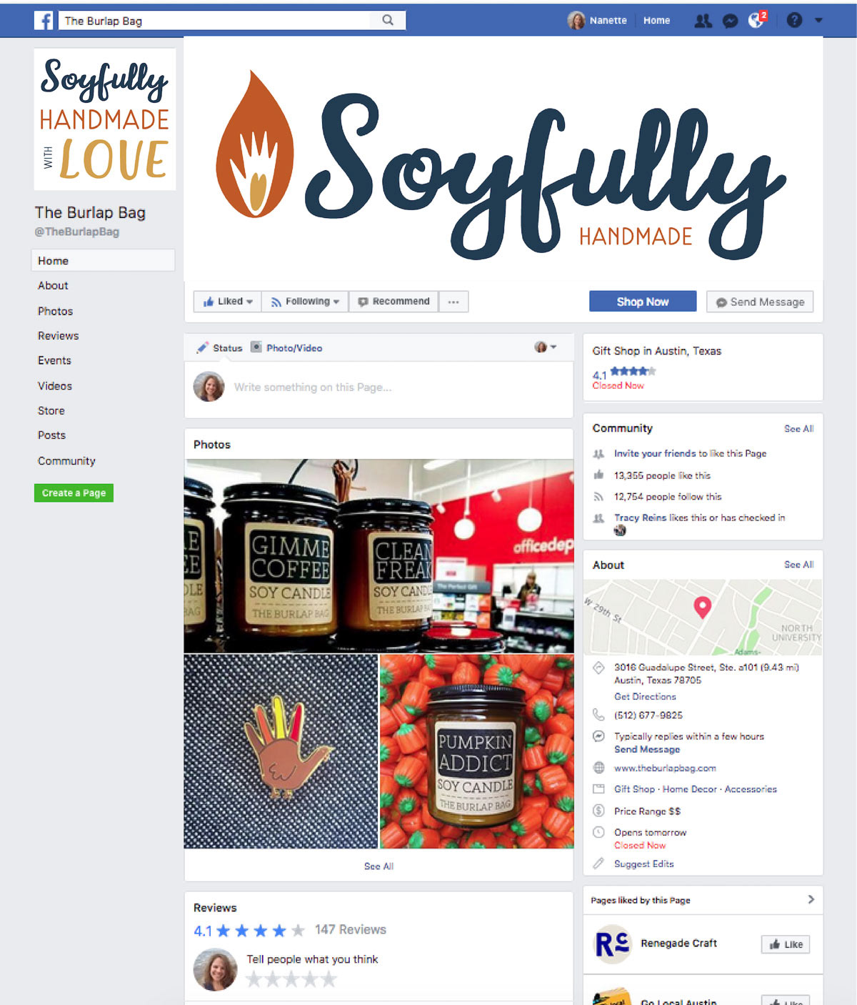
Aside from the passers-by and word of mouth, they advertise mainly through social media especially Facebook and Instagram. The logos on social media were not consistent.
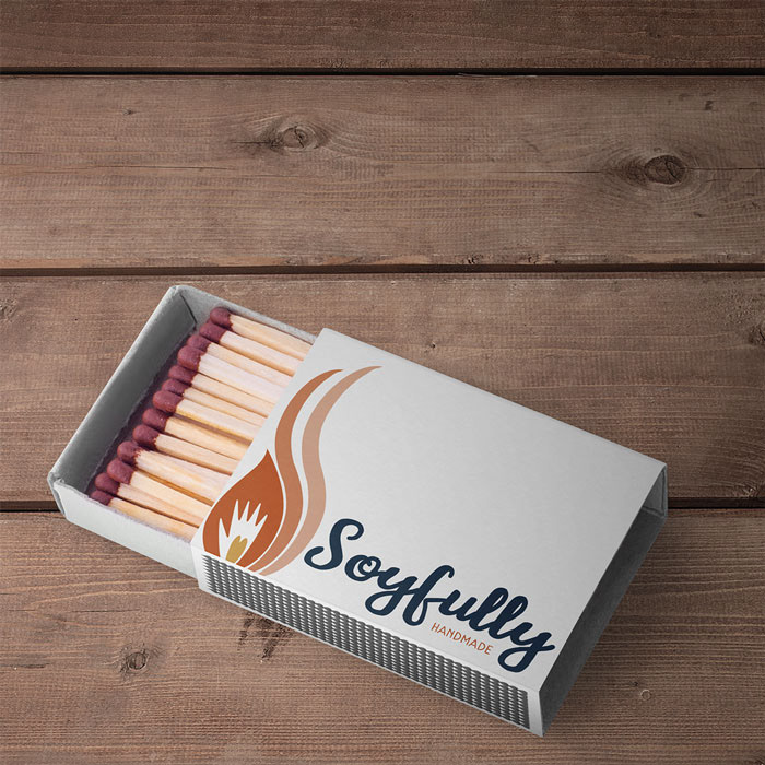
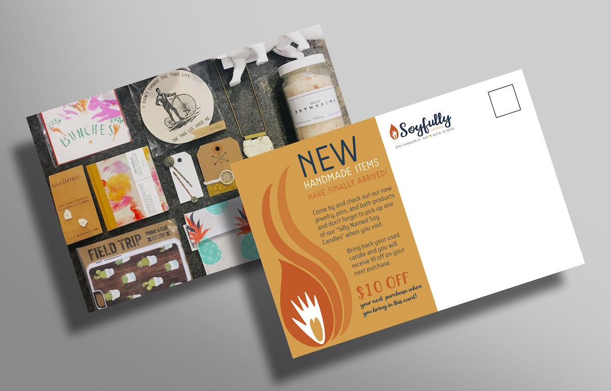
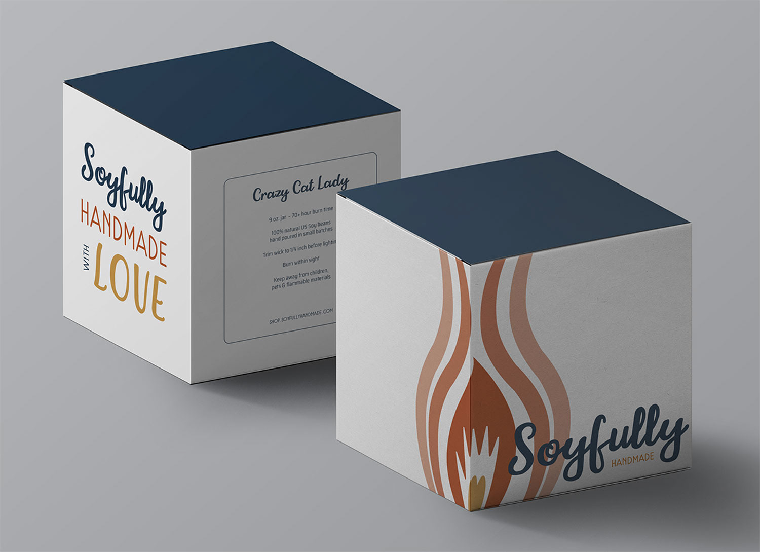
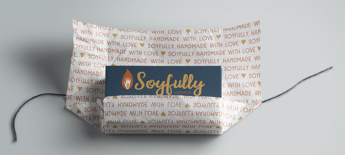
The name of their business feels incongruent with the current business's purposes and assets. The signage inside the store is differs from that outside. There's no business logo on gift bags or the candle boxes. The only printed items are business cards. The tone feels cold.
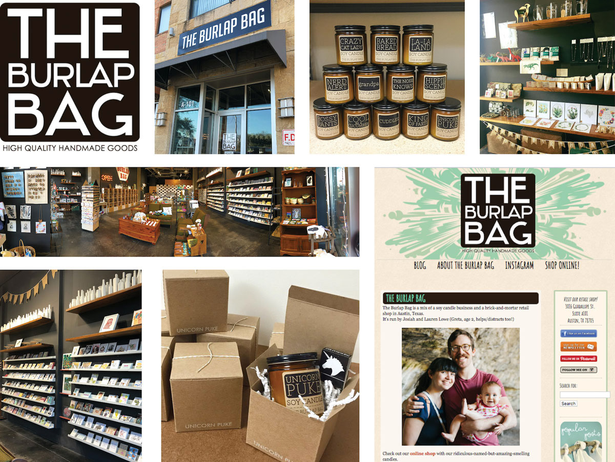
The Burlap Bag Assets
OBJECTIVES
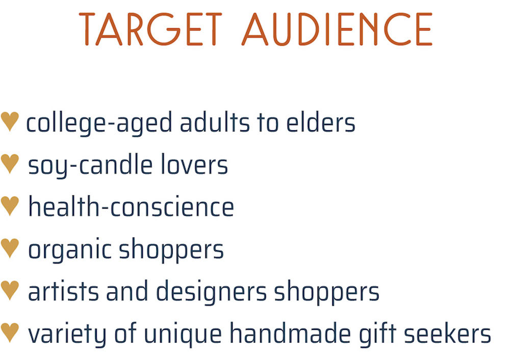
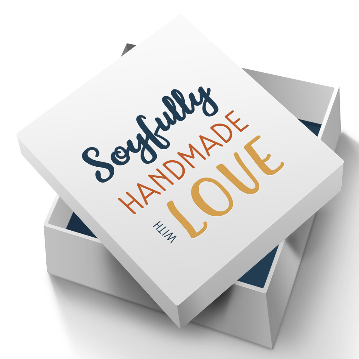
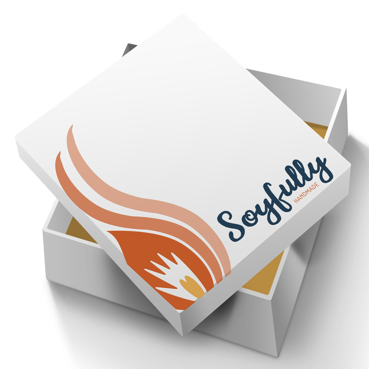
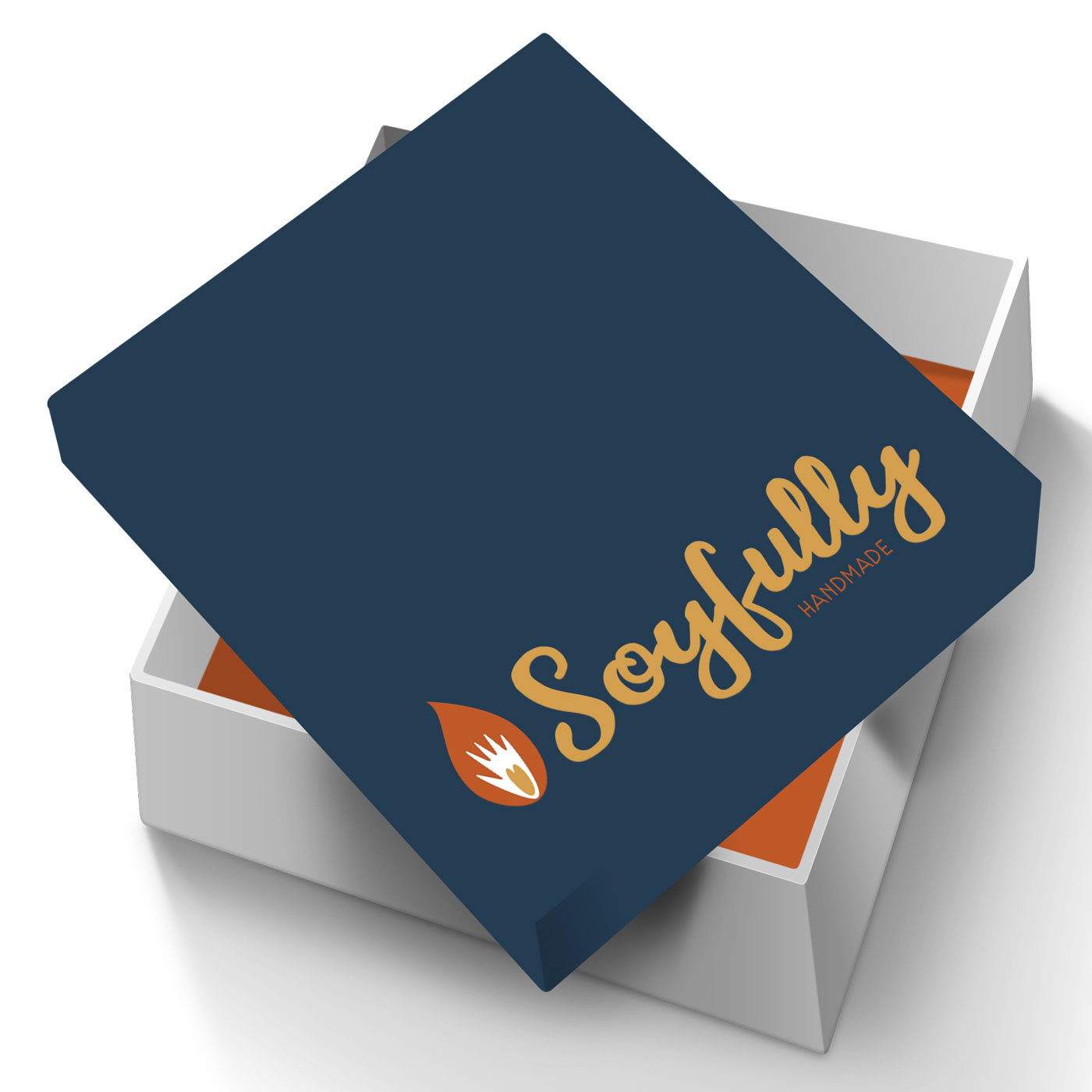
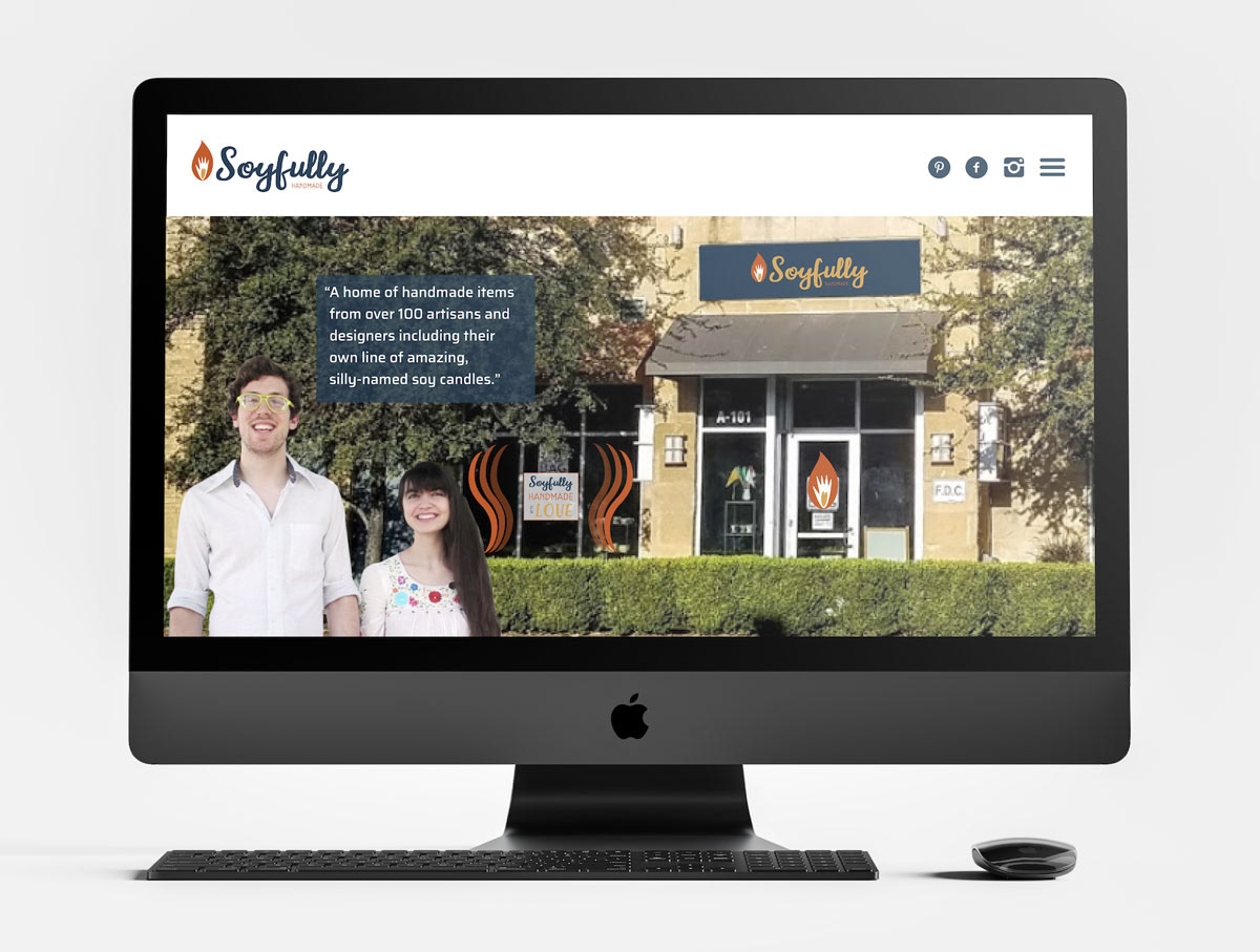
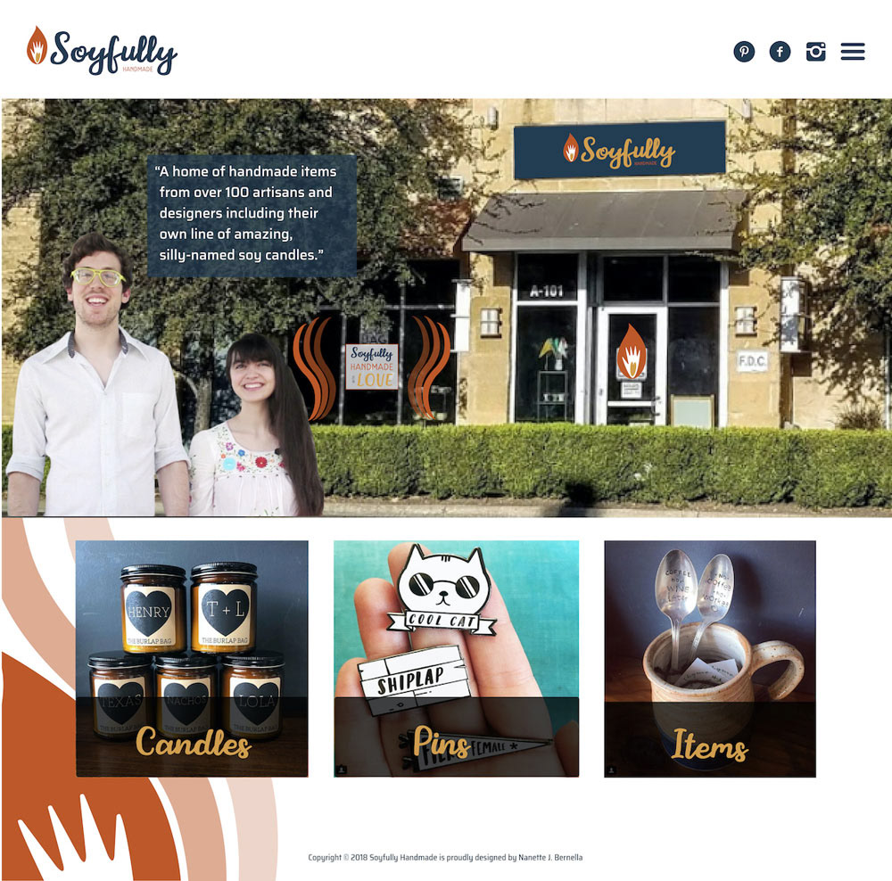
A creation of a unique and unified brand identity is necessary for the business including a new name and logo and applying them to newly designed website, Facebook, store signs, labels, and packaging. With the new brand identity, the business will be able to express itself well with these three adjectives: warm, unique, and handmade.
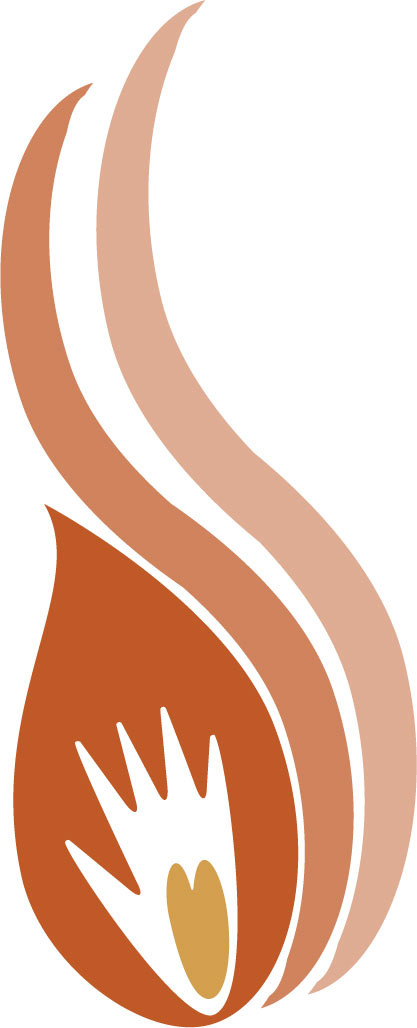
BUSINESS NAME AND LOGO
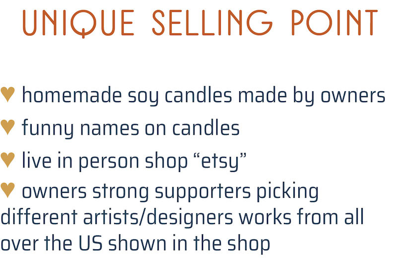
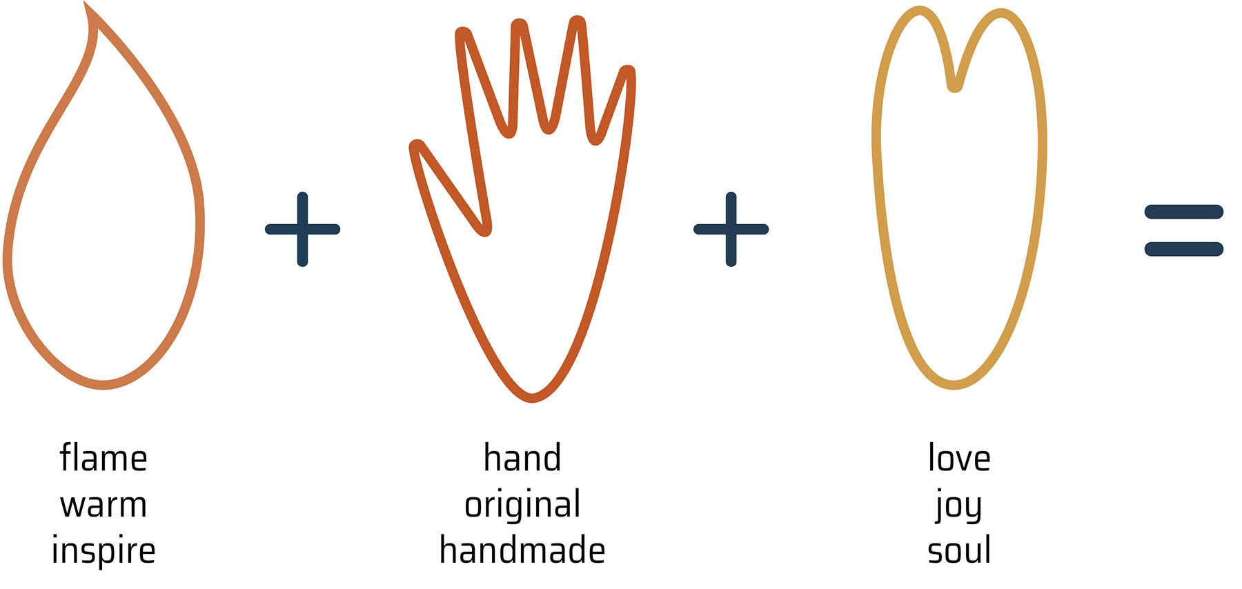
The business name, The Burlap Bag, has no connection to the owners' passions and souls in their line of soy candles and selling other artists' handmade products. They put in pride of being eco-friendly, using 100% natural soybeans in their candle-making. They add humor with silly candle names to provide buyers with some joy in their lives. "Soy" and "joy" sounds similar and the new name is playful, reflecting the owners and their vision of the business. "Soyfully Handmade."


SECONDARY LOGOS

without the mark

an option to place on dark background

other nifty design element

Instagram icon
PATTERN ELEMENTS
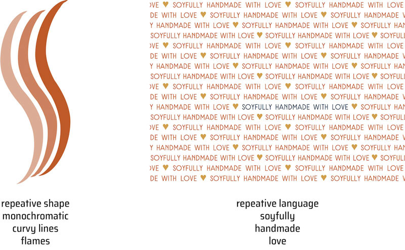
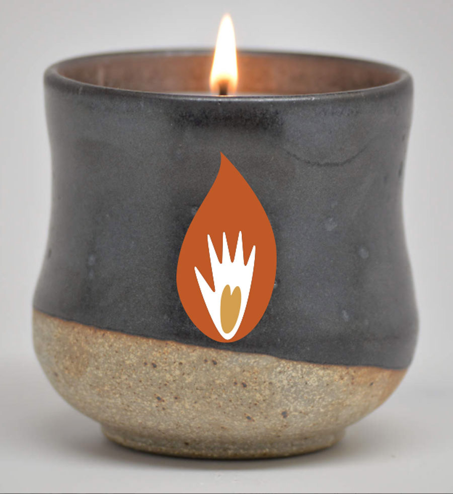
A few design examples using the mark with flame patterns.

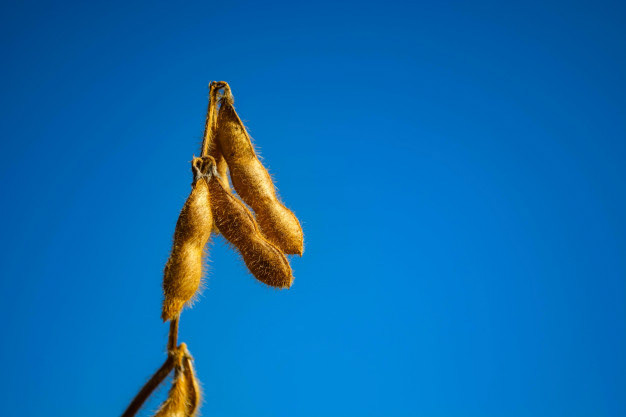
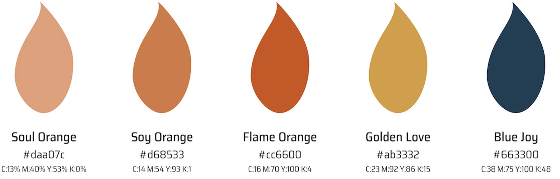
COLOR PALETTE
The colors are based on an image of a ripe soybean crop in yellow and orange tones complimentary with a blue sky. The orange has two other monochromatic tones to apply with the patterns.
TYPE PALETTE
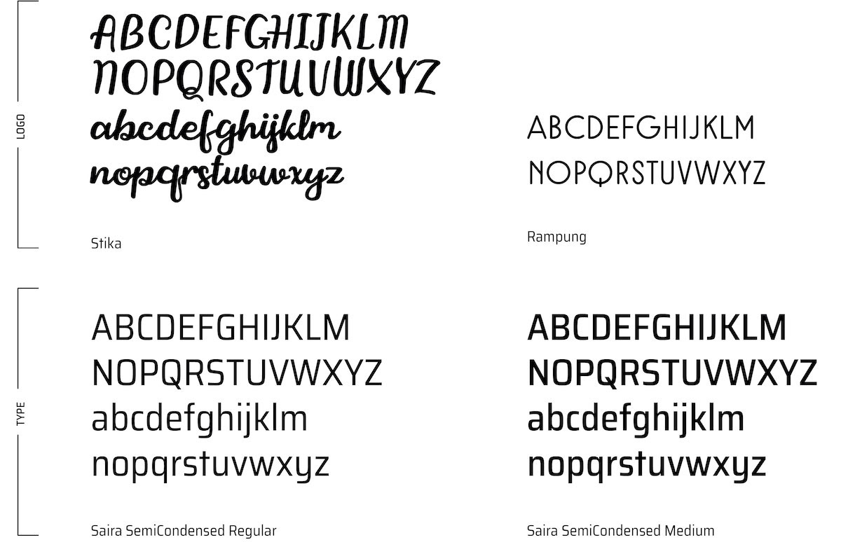
Soyfully is a playful and humorous name, hence it's fitting to choose handwritten typography for the logo to be used mainly for display. Another display type is a modern san serif only available in all capitals for clear readability other than the handwritten type. As for the body text, san serif with two different style was used for readability issues on prints. All chosen typography is tall and thin to reflect the candle flame concept and provide unity throughout the design.
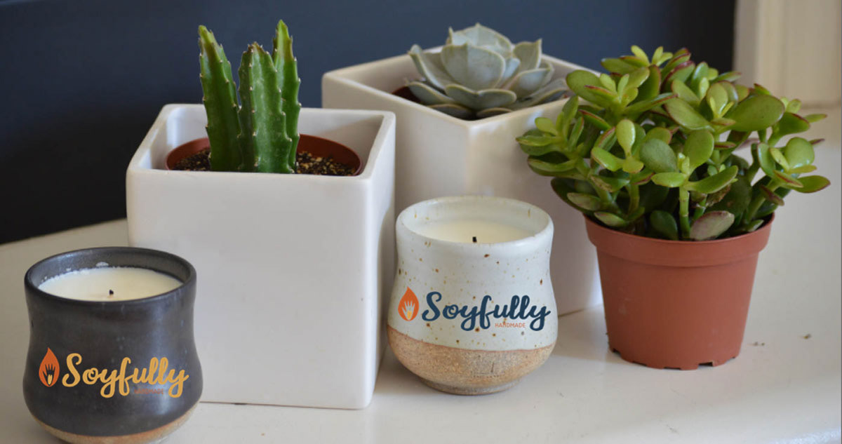
APPLICATION
Click images to enlarge
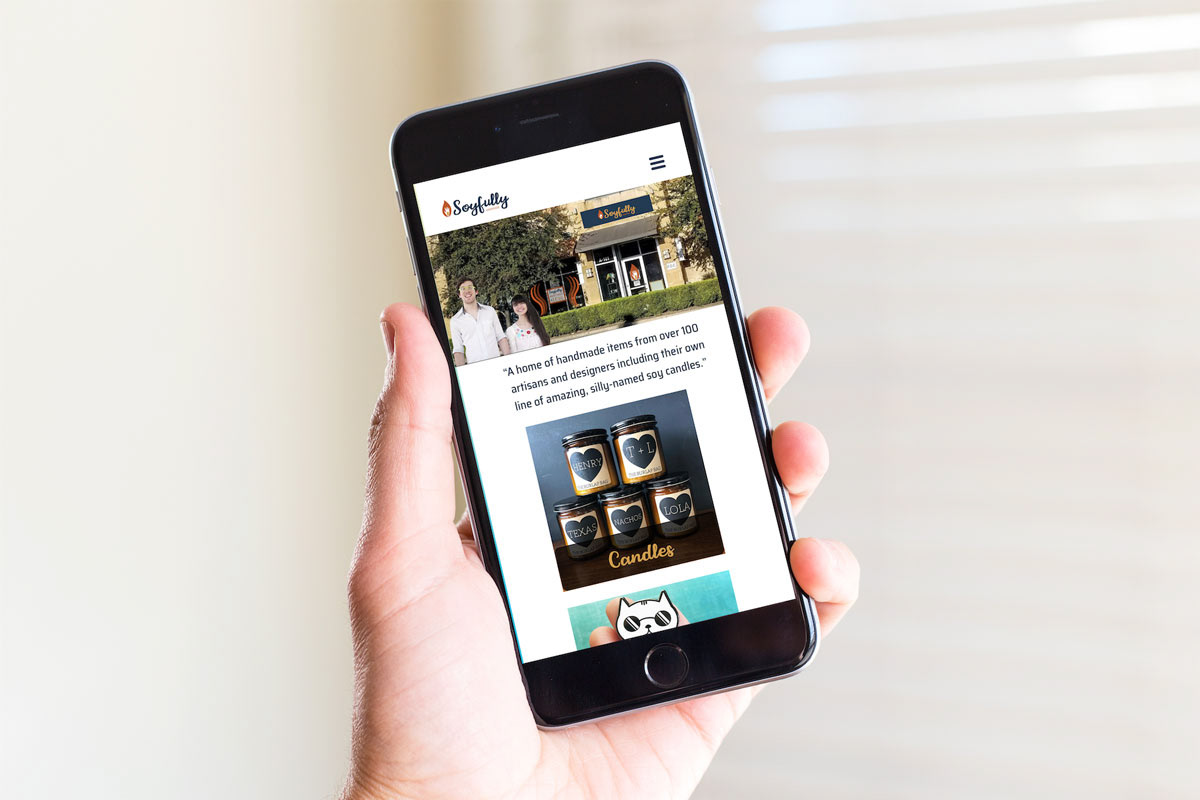
Digital BRANDING
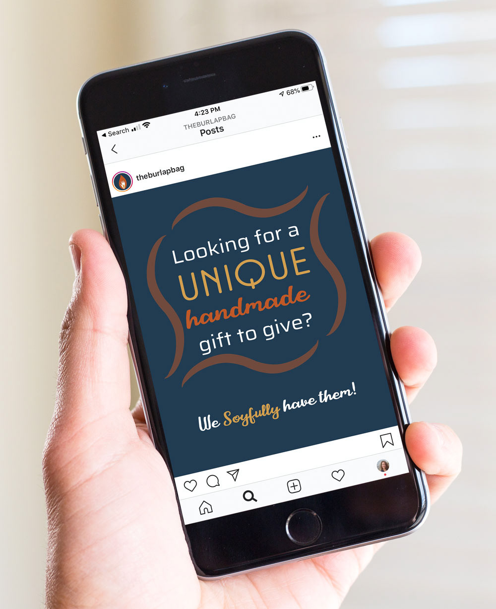
Mobile Version
Click images to enlarge

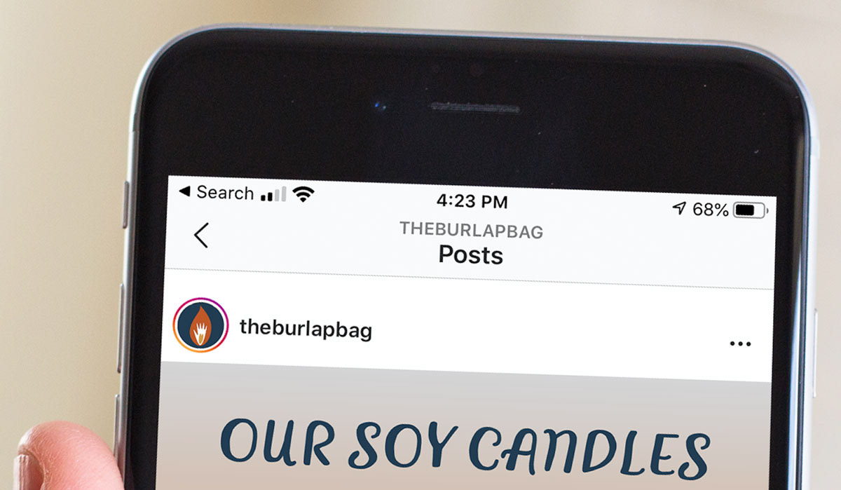
Notice the instagram icon is our logo mark.
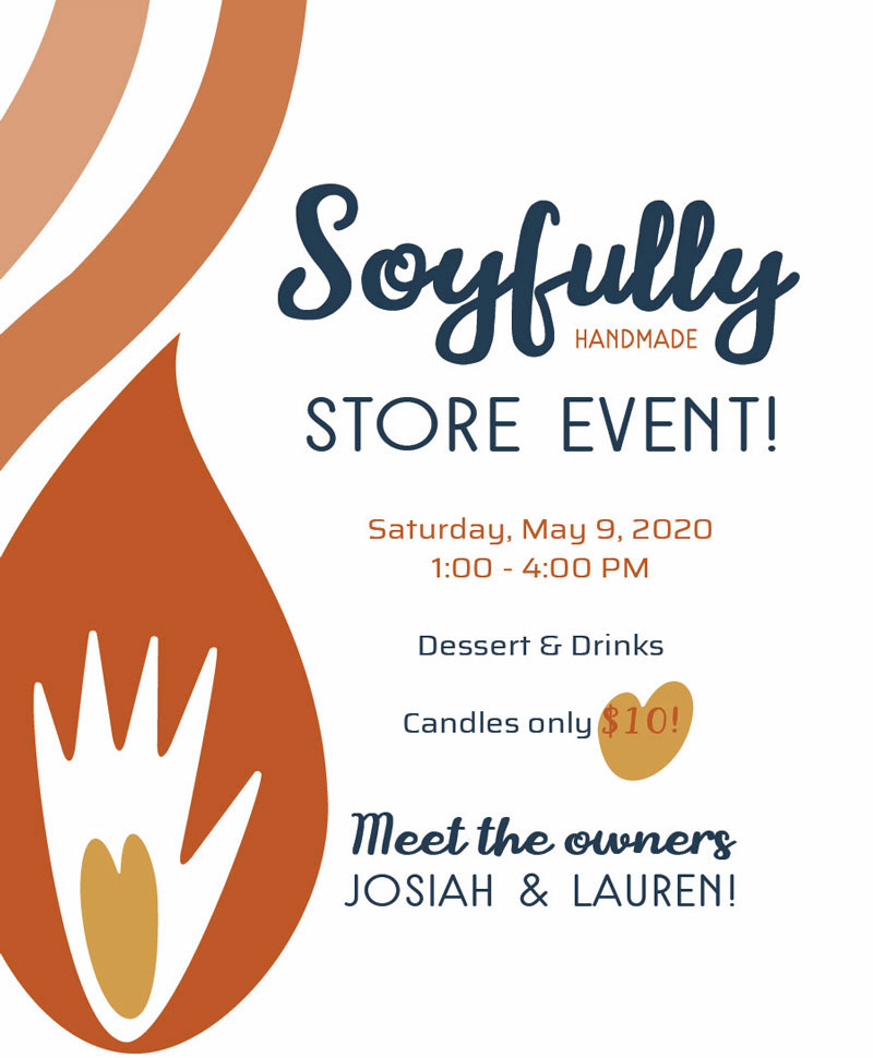
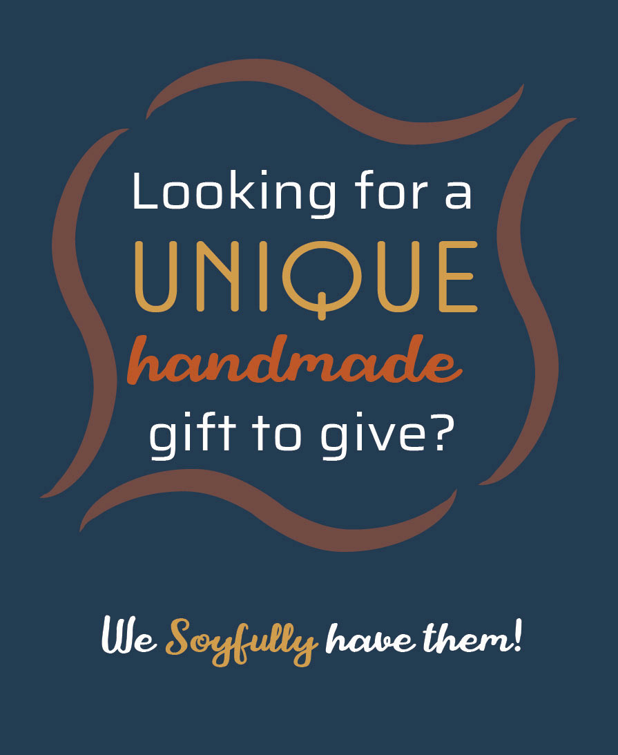
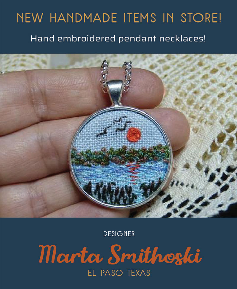
Four examples of social media posts for Instagram.
Click images to enlarge

SOYFULLY YOURS!
PROCESS